Tuesday, November 22, 2011

Re-living the Silk Mill at AOA

So we (the un-aided department) has finally got a new raw space.

Just two days ago as I was going through the Yale School of Architecture handbook, I realized that each course had its own separate instruction space with added seminar halls, research cells and other conveniences that they require. Each space had its own equipment too. I realized that as and when they start new courses, they add new physical spaces as far as possible it seems. Perhaps they never think of new courses unless they have space.

At Academy it's the reverse. However, the concept of recycling space in our kind of context is an interesting one. We save so much space - we save so much of everything! 

It is told to us that a part of this new space will be a 24 hour studio for our department. Let me describe this space to you. Its a roomy volume with a tin shed - something that matches my imagination of the school as the historical silk mill. It's practically open on all sides capturing excellent views of  the city. There is a lot of light, along with a lot of heat. We were wondering how to control both! Perhaps there was no one to supervise the whole work and there are hundreds of mistakes in execution of all possible things that exist here. The paradox of AOA is that all spaces in this architecture school are built without any involvement of architects as designers - we are just clients here. That's because the school doesnot want to pay professional architect's fees to any one who takes charge. So things happen - they just happen like buildings come up in slums.

But in appreciation, our expectation with this raw space is tremendous. We all (faculty) love this workshop like space which makes one feel in air. There is a large balcony that overlooks another one below. The volume of the space is nice, airy. The most important aspect of this space is the privacy it offers from the rest of the school. It could become a great thinking space - because it allows to wander and dream - it allows you to gaze deep and far.

I wonder how it will be handled by all in future. All have their aspirations with this raw volume - all want to carve out a space for themselves - students will want lockers, teachers will want workspace, meeting rooms, seminar rooms, projection spaces, exhibition area, work area, equipment storage, administrative staff... the space as I see, is already ruined. Some one spoke of partitioning the two class rooms. To me the biggest opportunity was the merged classes, where there are no boundaries. People just make smaller discussion groups. Eventually, many would want to have a permanent partition - because then they can sell the space, or lock up part of it claiming security reasons. However, a flexible partition must suffice.

We overdo all decisions. We will rape this space. I  am sure. In all possible ways. Students, if mature will understand that the best way to keep this space is open, so that they can pop onto each other desks across class and communicate and talk of ideas, debate designs...Teachers if dont have walls will be one with the students, nonteaching staff will be so much more a part of the team. I recall of a paper by Robin Evans called "Translations from drawing to building" where he says that 
"If there is anything that the architectural plan describes, it is human relationships, since the elements whose trace it records - walls, doors, windows and stairs - are employed first to divide and then to selectively reunite inhabited space."
Thus, to me, the absence of any definition of this space (the absence of the intervention of the architectural plan of the floor plate) is the biggest opportunity at hand we have. As soon as we divide this space, we will be demeaning all debates we have of reducing gap between students and faculty, inter-student interaction, the idea of being open, democratic, and all that!

Before any of the above happens, I have clicked some pictures for my record. We look at what future holds for this shed!


I wanted to write a lot more, but I will refrain. There are lots of ideas with this space still being a shell. We could keep doing so much with it just being a shell. Let's see...

Saturday, November 19, 2011

Dead Plants and Architecture

Today morning as I was leaving home for a visit to the CST building, I saw this plant in my house which was almost dead. Perhaps this happened while we were away for a week from home for my brother's wedding. I picked up the pot from our grill and was amazed to see the beauty of the dead plant. Taking a closer look, its leaves had taken permanent shape, they were crisp brown and refused to oblige. They had become hard and adamant. The leaves curled into itself and did not open up. It felt as if the plant was very upset, angry and  looked away into itself. 

Like we say, when angry, some people look even more beautiful. I captured this beauty in my camera.


Incidentally, at CST (Chhatrapati Shivaji Terminus, Mumbai), we saw similar ornamentation on the building. The visit was quite mundane, but refreshing after a long time. For the first time, I noticed the intricate detailing of flora and fauna on the different parts of the building. Animals, birds, reptiles...all in action adorned the building. Flowers too seemingly looked at us and felt like animal figures. Water and lamp holders spurt out of animal mouths. If we only put glass cases around all of these, the station would become a zoo-ish museum...


Sunday, November 13, 2011

Architectural Design Final Jury

S Y B Arch / AOA UA

This post was due since some time now. I have managed to put together some thoughts on the final jury for the last project that happened just before the Diwali vacations for the second year students. The design problem given to them was that of a play school - students were given a site along with requirements (brief). The method chosen to execute the project was the channel of mathematics. Students were to choose / develop / explore a mathematical system / ordering principle to evolve their design. Here are my observations after the closed jury:

Overall, the quality of communication through the drawings that we were seeing throughout the process had improved. The closed jury seemed to be helpful because students understand the importance of non verbal communication and try to update their sheets with as much information as possible. Sometimes, they over do it also. We decided to have a closed door review to avoid unnecessary theorization and misplaced jargon of words. Especially with a class good at getting away with talking, we thought it would be best to avoid discussions which become cyclic and subjective arguments.

Juries get caught up in pointing out drawing errors when open. Most of us are quite distracted due to the non conformity of thought in drawing that students generally produce. The drawings do not show distinct plinths, doors, windows (openings), roofs, etc. Structures or structural systems are difficult for students to comprehend.  Most projects wanted to take an intellectual leap in terms of formulation of a completely new, original module. Students invested much of their effort and time in this process. This could be concluded on the basis of the fact that most students were reluctant to work on simple grids to begin with.

The various ways in which the brief was understood generated a range of attitudes of working across the class  Most of these design attitudes were towards generating a formal architectural language. The form, to the students, unarguably becomes the most important aspect of the design process. It is the form that the students draw. Thus, it is the drawing that makes their sheets look dynamic and interesting. It is through the drawing that they are able to show their skills in design as well as its documentation. For the student, a lot of effort goes in deciding about the presentation - the format of the sheet, colour, texture, sheet size, way of rendering etc. The drawing is an intellectual product of the studio project, equitable to the actual building in its absence. The drawing is thus the building. Designing the experience of the presentation is the real project at hand.

Thinking in space, thinking of space and drawing of space (and not form) somehow remained the lacuna of the project. It is very difficult to communicate to students, architecture's engagement with space v/s parallel cultural engagement with form. We selected 6 projects out of the 42 or so for a final pinup. (of which i remember only 5 meanwhile). The projects at hand could be seen as different ways of working / different understandings:

  1. Concept driven
  2. Process driven
  3. Geometry driven
  4. Space driven
  5. Drawing driven
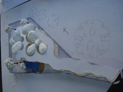
1. Sujeet Pehekar / concept driven: Sujeet's work was an abstraction of the figure of a baby drawn within the shape of the site. The concept of such form was successfully broken down into smaller scaleable modules which were neatly organized in structured cross sections of open-semiopen-closed spaces. The open areas were subtly detailed and the delicacy of structure was well understood.


2. Rishad Netarwala / process driven: Rishad's work reflected the indefatigable innocent play of cut-fold module that he came up with during the initial stage of his project. This flat module which encapsulated a variety of spaces when rhythmically cut and folded became the prime generator and regulator of space. By virtue of the module, Rishad's design did not need, nor had any special openings in his building. The module folded in to building elements of the roof, wall and the plinth leaving gaps between them (as they joined) to form sky lights, semi open spaces or inner courts.


3. Shantanu Bhalla / geometry driven: Shantanu's meticulous efforts in understanding and breaking down a 5-pointed star form and thereby using it as a planning, structural and articulating principle was the merit of the project. Shantanu's struggle in deriving all possible expressions in his design using his diamond shape module without being literal resulted in a play form that played with well thought out levels and well integrated inner spaces.


4. Pranit Rawat / space driven: Pranit decided in the initial stages of his project to work with a circular geometry coupled with a square grid. Initially he produced interesting gear like interlocking spaces by virtue of his square grid off centred to the circular. However, in the process, he decided to chaff out the circular forms from the square forming an interesting spatial composition on the site. The narrative he produced by the composition of well articulated levels, planes and openings in his space was the strength of his design.

5. Sanhita Vartak / drawing driven: Sanhita enjoyed the project through the drawings she made. The project displayed exemplary commitment from the student to think about how the triangular grid would work in layout of plan, skin as well as roof forms. The completeness of the project in terms of its drawings (deliverables) and thought in design made it commendable.


There were a few more interesting projects which were not discussed due to lack of time. However, I am sure the class's standard is to go higher in drawings and non verbal communication. This is something that they have consciously realized for themselves.