Tuesday, February 21, 2017

Squeeze lime in your Eye - Kaushik Mukhopadhyay

It might sound far too obvious to some, that the title of Kaushik's show asks the viewers to look closely, bringing near your two eye lids to each other (when thinking of actually squeezing lime in your eyes), reducing the focal length, and moving closer to the intricacies of the work that have been presented at the Chatterjee and Lal gallery. At once, you will notice the compounded nature of things that were packaged for you as a black box. We never dared to open them up, the gadgets produced in the electrical age, just before or alongside the first age of modern technology, did we? The television box, the computer motherboards, the printers, scanners and all sorts of gadgets that mediated our lives into the virtual world of the digital. Kaushik turns this world inside out, making the gallery into a laboratory of sorts where he jumps two steps at once. The first as I mentioned before, of opening up the machines inviting us to observe closely their anatomy. The second is to reconfigure them into new relationships through an inflected human agency. Challenging the autonomous world of machines, the new arrangements are left naked for a brave investigation of parts and pieces that we would never otherwise fiddle with.

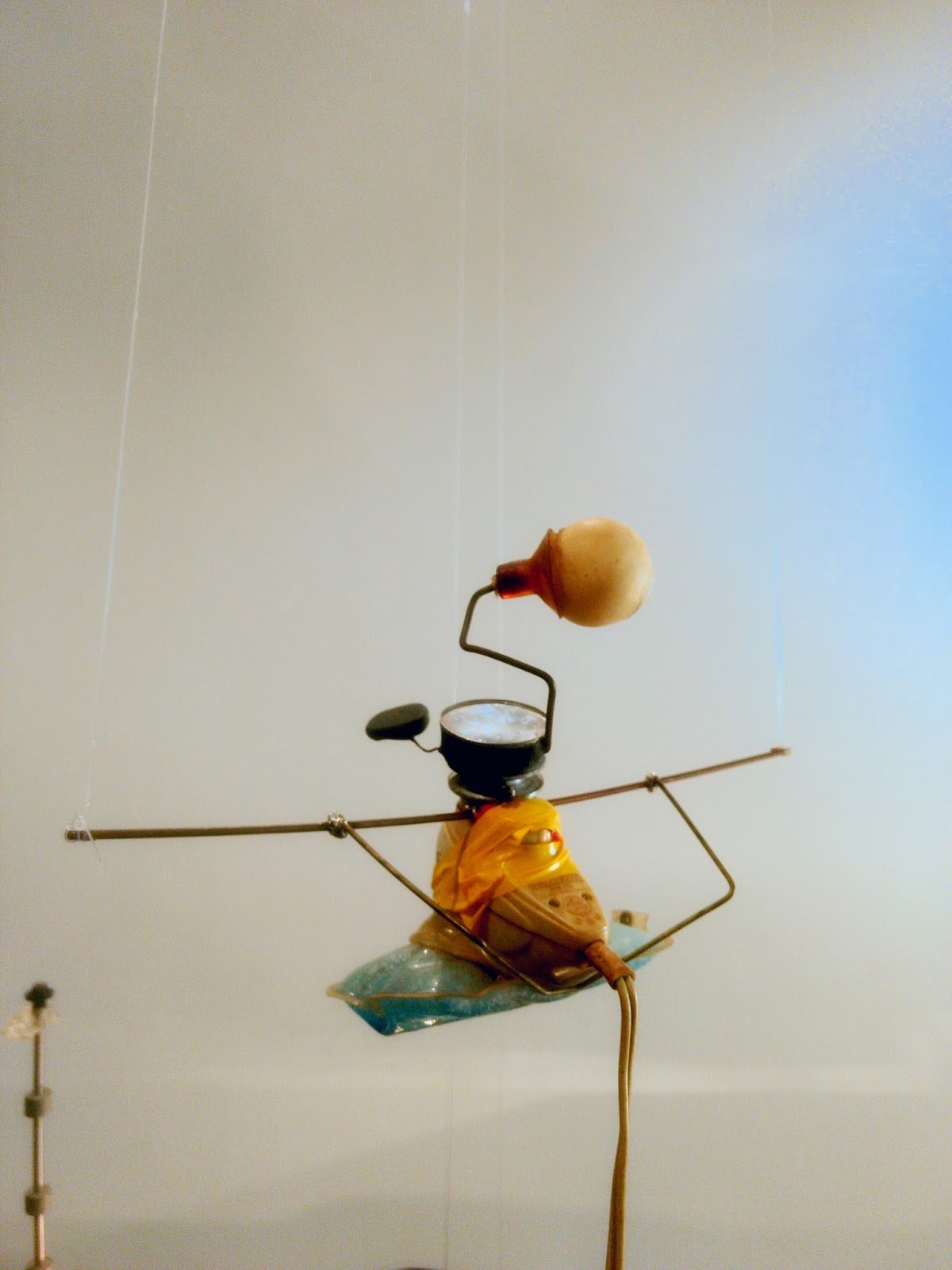
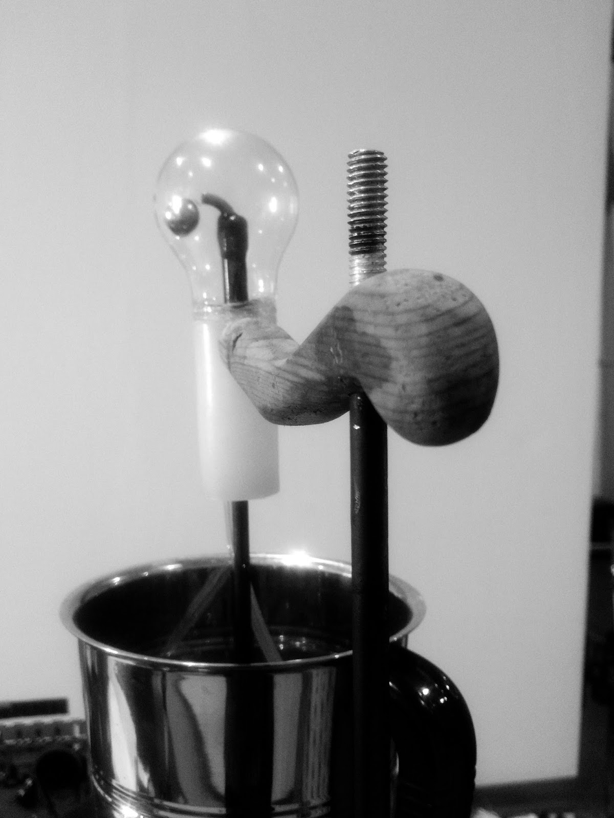
In peeling off their outer skins, the artist converts the interior landscape of the gallery into an orgy of sorts, where different machinic components hybridize in unexpected ways. At once echoing the technological version of Bosch's Garden of Earthly Delights, the exhibition whispers loudly the subterranean construct of our recent domesticity. Further, by fusing them with phenomenal experiences together, the project talks of machines as human extensions, and our cyborg-esque lives. A certain grim critique emerges in the creation of several pieces. The objects from the first section bring together the delicate and the robust in strange ways, where each material of either category have taken the characteristics of the other in a compelling way. The pink plastic flower-like fan stands on three fragile spider-like wooden legs, while restrained in lateral motion through a metal axle. The dangling scaled plastic water tank on an intricately wire-mesh crafted vertical structure reminds of the complex housing forms that people have shaped themselves in certain parts of the city. The precarious nature of the entire installation exclaims the exigencies of living conditions in the city. In the same section, another installation reworks a machine to lift a small load, albeit so slowly that it can almost be missed. However, engaging patiently with the work will bring to you everyday scenes of watching the heavy materials slowly lifted by cranes that can be spotted on construction sites all across the city.

Such parallels may be obvious on two fronts - firstly, from my own architectural training and reading of these works, but more importantly, from Kaushik's close pedagogical engagement at the architecture school where he has been teaching visual studies for about more than twenty years. An "architectural" reading brings out questions of form, space and their experiential relationships with human beings that seem to be embedded in most of these works. These may be explored and understood at two evident levels - the objectual as well as the representational. Scaled models are the most used instruments in spatial and form-al studies in architectural studios. When viewed as heuristic architectural devices, Kaushik's machines bring up complex narratives of city life - the manner in which the city sustains and decays at the same time. On the other hand, the exhibition provokes us to think how living for thus long with and around machines have immuned us to their voices, effects and the imbibed corporeal transfigurations that were never a part of our bodies and everyday experiences. Open display of bundles of wires, the array of screens, the series of bulbs and such other fields of spare parts shall certainly bring us to reconsider the world of gadgets that surrounds us. Today, we perform with these machines without necessarily questioning them.

At regular intervals, the entire space begins to chatter and clang with sounds and lights, perplexing and exciting you to capture the many minute movements that occur across all machines that seem to be invisibly connected. The bulbed spraying fountain, the waterjet scanner, the rotating disc, the ringing telephone, the hammering axles, the glowing bulbs simultaneously come to life, creating an environment of chaos and stimulatory excess.  It is here that Kaushik hints to the squeezing lime once again - to the tendency of resistance that may cause ourselves to shut off to such world of simulation. This exhibition may not point at, or even address ideas about aesthetic in the sphere of the visual. It is visibly chaotic, where no contraption shall offer you a pleasing background to take a picture. Each machine is seen in the backdrop of the other. It will not offer you easy answers. It begs yet again, to squeeze lime in your eye.


Monday, February 06, 2017

Perspectives: A Reflection

This is a compilation of forty-or-so perspectives drawn by first year architecture students. Given to them as one of the first exercises of technically drawing a simple object bound by two vanishing points, the exercise comes to offer much more. Or rather, should I press that one can read much more? After all they are perspectives.

In addition to the original oblong (elongated cube) object, I suggested students to put additional features, partly so that each student applies the principles just learnt to exercise their knowledge of the subject and so that each of their objects is unique, almost creating an “alien” object – an object that is unknown to us. Creating an object without visual precedent is much difficult, for how does one draw something that one has never seen, and how does one even perceive and make an object that must never be familiar? In the present case however, one did not pre-decide on making alien objects. It was merely about evolving a known, standard and mundane shape into the undecipherable. This exercise has thus culminated into the hybridization of the familiar and the unfamiliar. Can there be a possibility where two known objects come together to generate a stranger? How would one go about employing this thought? Is there a method? Has this intention been fulfilled here? In this ambiguity, I am eager to find from the readers if the objects here are able to generate a sense of the uncanny.

The outcomes presented here begin to hint different patterns. While some additions seem like evident detached outgrowths from the basic oblong, few examples show how even smaller alterations can change the fundamental perception of the object. There are others where the oblong has merely remained a notion, and instances where its reading has further compounded. In my personal pursuit of achieving “aliens”, the basic object has grown different extensions to itself, those which can be read as organs that may perform imaginary functions, or sometimes even remain redundant.

Often the overall object becomes vividly impressionistic reminding of a figure, icon or gesture. This brings me to notice how each object demands for itself a particular scale it must be seen in. Is the notion of scale embedded in the object; is it constructed through our years of visual training or do we impose scale on to the objects? To be sure, the interpretation of the same drawing at multiple scales is facilitated due to the absence of any reference to human scale. While it may seem to be a toy-like object in a quick glance, the drawing soon becomes spatial and inhabitable when subject to a slow meandering gaze.

Further, it is interesting to compare one drawing to another. Since each drawing is produced by an individual, and each addition / amendment to the basic figure is mostly personal, some of these drawings strangely begin to talk with each other. One will observe how, for example, few drawings are same configurations merely rotated, some fit into each other as positives and negatives and some others could easily be seen as a kit of parts. They could join each other to form a larger whole. How do these “communications” happen? Are these resultant compatibilities purely accidental? Do people work with a common notional repository of forms? If so, what are the mechanisms through which such a repository gets activated?

I had asked the students to reproduce their working sketches into final drawings on square tracing papers. While my original intention was to save them the labour and allow them to quickly trace their final work, I realized that the translucency of the paper lent me several further comparative readings on being overlapped. For instance, I observed that many of these drawings of the same specified object (the one before addition of parts) did not coincide with each other. The dimensions of many outlines differed. In addition, their view points and horizons constantly shifted. What added dynamism to the entire compilation are the students’ varying compositions of their drawing on the small canvas. All these reflections indicate the inherent nature of perspectives – the manifold ways in which standard instructions get interpreted, executed and a singular object in the head gets transmitted and reproduced.

Washing machines, paper weights, acupressure tools, milk cans, building blocks, household furniture – these drawings will remind you of all such objects. Yet, they are not those, or perhaps they share a familiarity with all of them? How do we look at these products, or even reflect upon this exercise? The execution of this exercise, if one may excuse, can be observed in line with the history of perspective drawing. While much of the initial effort in renaissance art was to understand the principles of vision in order to replicate reality as it is, architects of the period furthered this technique to prepare realistic visions of the future. In a similar way, students prepared an object that was made available to them as a drawing but took it in a direction of the unknown mostly following their (own) aesthetic logics. The only difference in this case, perhaps was the freedom for students to be not bounded in imagination by scale, utility or gravity. Yet, this leeway is only to playfully sustain the spirit of the contemporary times, when almost everything seems possible – from future machines to transmutability of objects.

I will be cheating if I said that all parts of all these objects are technically drafted. In times when computer softwares aid more than realistic visualizations and renderings of spaces and objects, what does a class on hand-drafting perspective involving meticulous measurements on paper actually mean? Machines have certainly reoriented the value we put on traditional techniques of creating imaginations on paper. And we would be expecting too much from students to relive the passion of Albrecht Durer who tirelessly built machines to understand how, after all, the magnanimity of the world converged into his eyeball! Such curiosity neither fits contemporary zeitgeist, and nor can it be sustained in a world scattered within technological distractions.

In such a view, these drawings are to be appreciated with a pinch of salt. While many are sincere, some drawings here are opportunistic - those which have been crafted to please the eye, or even finish the god-damn alien. These probably come from different evaluations of the machine-manual debate, and further the multiple ways in which students come to develop interest in the varied aspects of architecture. Many drawings here also contest the intention of applying the skills to be learnt through this exercise, putting primary thrust on the imagination (which assumedly is free of skill). A closer reading of these drawings will bring us to an understanding of how the relationship between skill and imagination gets negotiated in the works of students.

Yet we are fortunate to live in times when the expert who once produced perspectives by hand lives alongside his/her technological counterpart. In the course of this studio, the students got a chance to interact and learn the way in which perspective was traditionally deployed by draughtsmen or skilled architects or artists into making architectural renderings. Those renderings, to a keen observer would be venerable. Today however, the demonstration of skills, instead of the art itself, becomes the product of exhibition. The act of witnessing the art emerge makes us wonder! Whether the art or the act inspire us to pick up a pencil and produce art is an open question. One will quickly find oneself in the dilemma whether such a decision even makes sense in the age of the computer.

The computer still allows one to undo, redo and alter parts of drawings easily until one achieves the desired image. It is not easy to put oneself through multiple iterations, like the computer, until perfection. Many works here are witness to such struggle of achieving perfection. Errors and erasures have thus remained a part of this compilation. What attitudes do students have towards achieving perfection? One of my friends, in order to mitigate the trouble due to my idealism for perfection, would console saying that if you can’t achieve the expected, lower your standards. Perhaps many of us, in our times, were brought up with values of getting everything right, perfect. This often burdened us with a lot of self-expectation. Today, many students are freer, filled with enthusiasm and positive hope to perfect themselves over time. Errors or imperfections in their works do not bother them as they did to us. This allows them space and time and confidence to keep going.

These drawings thus bring many of such experiences to me, which I anticipate, will be one of the many readings you will also have. You will align with my thoughts if you are an architect, and more importantly a person teaching architecture. Moreso, I believe the thoughts shared above are also a result of subjecting architectural drawings to an art historical lens. I wonder if such an analysis brings to us any value in our teaching or making of architecture. Otherwise, this essay can be just left as a perspective.


a reflection on drawing studio works of SEA students
2015 | Anuj Daga


School of Environment & Architecture, 
Eksar Road, Borivali West,
Mumbai – 400 091. INDIA.


Monday, January 16, 2017

The Politics of Representation: Charles Correa

The Politics of Representation: Charles Correa
Anuj Daga
For IES College of Architecture’s Annual Magazine ‘L’espirit’, 2016

Cover page of Charles Correa's monograph


Architect Charles Correa’s monograph published in 1996 was one of the most worn out books in the library of Academy of Architecture, Mumbai where I studied. Despite the fact that it was on permanent reserve at the school library it was referred by students far too frequently; to an extent that it’s binding had gone loose. The dismal condition of this book was inevitable given students’ keen interest in Correa’s works. At the same time, it bears witness to the fact that Charles Correa was, and still remains the most celebrated architect in India. Many of the students would always skip the introductory essay authored by historian Kenneth Frampton, or the one by Correa himself that followed. Instead, we would quickly move on to study the beautifully hand rendered building drawings of his projects. Importantly, these plans and sections were drawn by hand, which we believed were prepared by the architect himself. The style of these drawings was instinctively emulated by many of us into our own studio presentations, as for most of us (like students studying architecture in India even today), such illustrative drawing style became synonymous in conveying a certain idea of rootedness, perhaps even “Indian-ness” in design.

While we had no direct access to meet or talk to Correa, we primarily understood his architecture through the representations of built works published in his books. Correa’s approach of using local vernacular idioms in his building responses like the image appearing on the cover page of his monograph, together with the hand-borne aesthetic character of the representations published within it convinced us about those drawings too, to be prepared by him. Through the process of practicing what we assumed his style of drawing, we even hoped to acquire or appropriate an architectural sensibility of the aging Master, and thus to continue his legacy.

When Charles Correa planned to retire from architectural practice by the age of 82 in the year 2012, he decided to donate his entire archive of drawings, photographs, letters, models and list of published works to the RIBA in London. I was fortunate enough to be a part of this massive archiving project at the office of Charles Correa, which was carried out with the help of his office employees. It gave me an opportunity to observe closely the nature of Correa’s practice – the work of a figure we revered and the drawings from the monograph of whom we almost consumed invariably. To my surprise, I could not locate any drawings in his archive that looked like the ones in his monograph. In fact, I discovered through the co-employees at his office that Correa hardly preserved the process drawings he made for his own buildings. In addition, his original drawing style that I observed being an archivist at his office was quite different to those predominantly occurring in his monograph – one with uncontrolled, uninhibited swiping strokes instead of the slow, undulating ones that we had learned to emulate based on the published monograph. It is here that I came to question for the first time: who made those drawings for Correa’s monograph and why were they rendered differently from Correa’s own style? And how, in this situation, was a peculiar kind of representation technique chosen?

The works of Charles Correa often become a comfortable and pleasing aesthetic to settle for an “Indian” response in built form. They were also backed by the geometric diagrams introduced in the Vistara exhibition, as depicted in his monograph. We seldom looked beyond the Correa’s works as represented in his monograph to decipher the political and geographical forces that shaped his buildings. After detailed research in looking into Correa’s career, his architecture appears to be much more complex and ambiguous than what we as students simply accepted as Indian. I have come to realize that the imagination of Correa’s ‘India’ is shaped by, or even shaped for a number of political and geographical factors that transgress national boundaries.

To cut short to the untold story of the drawings - the sketchy, undulating drawing lines were chosen as a means of reinforcing the Indian identity in Correa’s works – they not only relate to the older Indian artistic representations but also the traditional village building forms made out of hand-plastered mud could never be a perfectly straight line. These practices that imparted an innate visual character to the built forms, in Correa’s mind, became Indian. I got to confirm this while working at his office in a candid conversation over lunch one day when Correa went on to say, “Even the Indian khadi fabric looks beautiful because it does not form clean straight lines. The undulating warps and wefts give character to the cloth, it echoes our culture.”[1] In the pursuit of translating this culture into his architectural representation, Correa commissioned employees from his office to reproduce the drawings by tracing over plans and sections technically made by drawing instruments or computer softwares to give an effect that not only allowed a simpler reading, but also strongly relate to the above-discovered theme of the rural and minimal, in other words “Indian.”

Harshraj Mane, one of the contributors of such drawings explains what he learnt under the guidance of the master architect. In a sense of repeating the master, he explained, “When you have to re-draw and abstract the design to re-present it, you focus your mind on the essence of the design - it is planning, navigation, proportions, shadow pattern and then accordingly make the drawing. Also there were parallel artists like Mario Miranda, R K Laxman, warli painting style, to draw influence from.”[2] The “essence” that Harshraj points out is certainly the notion of Indian that was coined in Correa’s mind after the Vistara exhibition – that which were located in traditional art forms and heritage of India. This is precisely the reason why Correa’s own style of drawing – the free flowing quick strokes unlike the poised illustrations in the monograph, that I noticed when I saw him in action while drawing in his office were not used throughout this publication. As we may now reason, in Correa’s own imagination his drawings were insufficient in conveying the spirit of Indian that was originally informed and established by the artistic building forms included in the Vistara exhibition. The building drawings thus reproduced in the form of undulating hand drawn sketches in the monograph, visually perceived like the rustic, unfinished aesthetic of traditional art forms in India undoubtedly made the works appear more rooted in the place.

In the light of the above study, Correa’s ability to steer the reception of his work as extremely relevant for national as well as international audiences at the same time is worth noting. It is this aspect of being able to mould complex political and geographical realities that have emerged as the highlight of Correa’s practice – one that must be remembered while evaluating contemporary architecture in India.


The drawings appearing in the Charles Correa monograph, often understood to be drawn by the architect himself.

The actual hand drawing of Correa.


--
ENDNOTES

[1]I quote this from my personal conversation with Charles Correa while working at his office. Mr. Correa was referring to the hand-plastered walls of villages that do not have machine-finished crisp edges, instead evoke a sense of human involvement, when he stated his impression about the Indian fabric.

[2]E-mail interview with Harshraj Mane, former employee at Charles Correa Associates.
Mario Miranda was a famous Indian cartoonist based in Goa; R K Laxman is a well known illustrator and cartoonist from Mysore, India and warli paintings are folk paintings made by a tribal settlement in Maharashtra called “Warlis.” These drawings are illustrative renderings of everyday life drawn using white paste prepared from crushed rice.

--
NOTE:

This is a short extract of a chapter for my master's thesis "In the Place of Images" submitted to the Yale School of Architecture, USA, 2014, towards the completion of Master of Environmental Design program. The original chapter investigates the geopolitics of Charles Correa's practice over his architectural career.

Thursday, January 12, 2017

Lokmanya Tilak Terminus / New Wing

I know - it opened some time back - so it's hardly "new". But it was quite new for me. And I was pleasantly elated with the building, particularly with its scale and the quality of light. For a change, it did not have bulky over designed columns and a heavy roof. The barrel vaults gave it a sense of dynamism and airy-ness.

The different facilities were spaced decently well. The building was perfectly functional, had a clear diagram. Not glitzy, no patterning, not into frills, I felt it was after a long time I felt nice about a public building in Mumbai.

Any help on who designed it?


Sunday, January 08, 2017

Young Subcontinent

I have been writing reviews of artists' work shown as a part of the Young Subcontinent Project, curated by Riyas Komu in Goa for the Serendipity Arts Festival 2016. 

I invite all the readers here to explore the above writings and artworks on www.youngsubcontinent.blogspot.com