I find fascinating to visit University campuses. Over the last two weeks, I had the opportunity to visit University of California, Berkeley as well as Stanford University.
Here are some pictures from our visit to Stanford. Considered to be the ivy league of the West coast in USA, like the ones of the North East, Stanford's physical character is absolutely different. The first impression that all of us got on entering the campus is that of a hotel resort - with large lawns, topiary gardens and sloping roof in clay tiles - the university's image was nothing short of a holiday resort. The school is situated in Palo Alto, one of the most prosperous suburbs of the Bay Area. The suburb is known for its high end family homes neighbourhoods.
One is greeted with a large 'S' for Stanford grown in red leaves with sinuous serpentine curves - something which had a tendril-like curling quality. We all were unanimously put off by its execution, and in our own exposure and growing up in the environment of the ivy leagues of the north-east, this aesthetic expression was laughable. Apparently this landscaping of the 'S' keeps on changing every-time.
The school buildings are nestled within the green, although flat landscape, where the campus tries hard to be stately and modern at the same time. One gets an uncanny feeling of tropical ashrams, with almost outscaled courtyards centered with large evergreen spreading trees. I don't have much to really talk about this place, since we didnot have an opportunity to wander much inside the buildings. Except that we did sneak into the D-school.
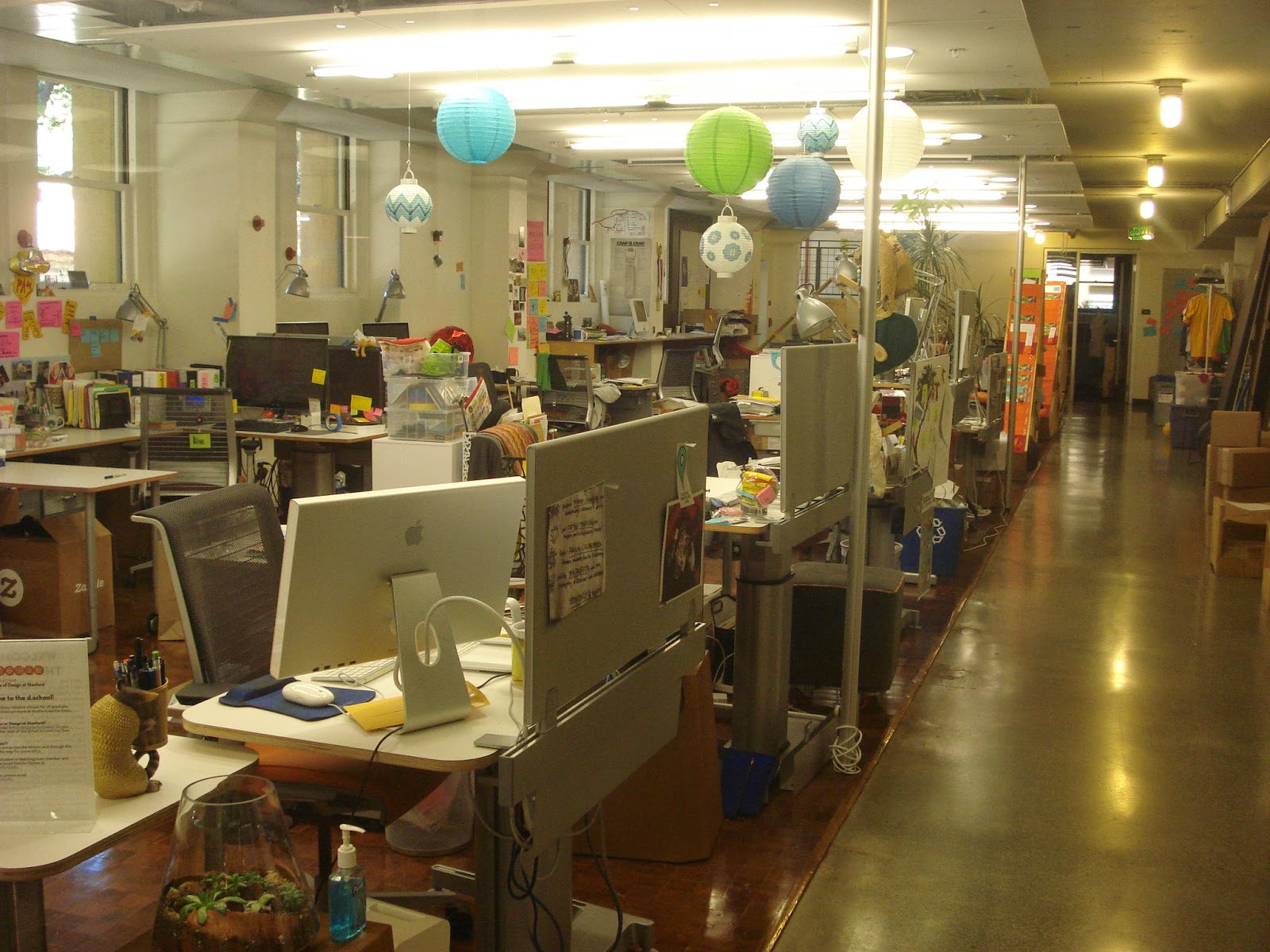
Stanford is famously know for its interdisciplinary D-school, ie, the Design School. The nature of the school was like an open space, where different kinds of people can collaborate on problems through the platform of design. There was a looming blandness of the digitality of cyberspace in the actual physical environment of the D-school. Flat white surfaces to be written upon, movable furniture, post-its, cubicles and limpy blackboards - everything as etheral and unstable as the flash of pages on a website composed the atmosphere. The wateriness or the fluidity of all objects in space took me some time to appreciate, although I wasn't sure if I got it right!
Somehow, the post-it aesthetic (people writing mini lists and thoughts on small square colourful stick-ons pasted onto the walls) is highly overrated. Look at every design thinking wesbite today and you will find a representational picture of "thinking" in the form of a constellation of post-it pink-fluorescent green-yellow notes! To sum it up, they have literally "reduced" design thinking to keywords that can be contained into strips of paper. I have a whole theory of the post-it aesthetic, which I am being bombarded with every now and then as I visit these design places. I wonder if they have tie-ups with the post-it note manufacturing industry!
In any case, I think I might visit the campus once again to know it better and also look at its art-gallery. I have noticed that the West Coast is much behind than the North East in the US in its cultural production and aesthetic standards. Rather, much of the thrust is on the aesthetic of the virtual space. There are some awkward gaps in the physical spaces here, which I hope I am able to articulate eventually on sustained observation of this place.


No comments:
Post a Comment