Thursday, August 14, 2014

San Jose Museum of Art

Below are some images from the San Jose Museum of Art that I visited today. The museum has a modest collection, with a great variety of art from the artists primarily from the west coast. I do not have much to add about the museum because it is a really small museum, more like an art gallery that has some well displayed work! I struck on conversation with the docent tour guide there who has been offering tours within the museum since the last 20 years (1995). She told me that most people like to look at the art works on their own, so she ends up going up to people to find out what they like about the art works they are seeing within the museum space. 

I also visited the Contemporary Jewish Art museum in San Francisco yesterday, that I will probably include in a separate post with more about the city, sometime! Meanwhile, here are images from my visit today.


Tuesday, August 12, 2014

The Chaos of Representation

A few hours ago I discovered that the 'Indian Architect & Builder' - a popular architecture magazine from India allows you to access several of its past issues online - they have been chronicled on issuu.com. Since I have not had the opportunity to keep in touch with any contemporary architecture happenings in India for the past two years, I decided to browse through a couple of published issues of the magazine. I looked through some of these issues noting the cheesy captions, reeled through the catchy images and skimmed through the texts. The subjects were all familiar - catchphrases, compositions and vocabularies - all presenting the chaos of representation within the field of architecture in India.

When magazines invite architects to write, they play lenient on their submissions by asking the in-house staff to not judge them for their writing. I have been a part of this process, and was asked by my editor to keep in mind that "they are not writers." However, the question, I feel is not about writing, but about the methodical deployment of an idea. Most architects in India work in a hybrid fashion drawing visual ideas from multiple sources, which tie together into their building designs inconsequentially and many a times unconsciously. I will not be able to point out specific examples, but if you take a look at the building plans, elevations and sections, along with the strategic ways in which their photographs are shot after their completion, you will immediately realize the predominant ideas influencing them. A trained historian will be able to critique it more efficiently.

The written language in which architects express themselves is inherently problematic. They do not necessarily deploy their designs in what we conventionally understand as "methodical", and thus considered that the making of architecture in India is much organic, constrained by multiple forces during the process of construction, where design decisions are continually changed and developed (as against western practices where designs are frozen and lived by till the end), it becomes inherently difficult to not only map these influences, but also make sense and rationalize much of the decisions verbally. I am making claims that I am not substantiating, for I will need to sit with an archive. But if one compares the representation of a particular project in text, image and captions, it is hard to put them together, for I believe that each of these are imagined through different streams of thoughts and directed to appeal different kinds of masses! 

The interesting aspect is that over the past two years, I was trained to do all things methodically: the reading of a book, an image within the book as well as the text accompanying it. In addition, I was being taught to write methodically, step by step, considering and critiquing the images and its description in text. This has brought me to analyze the way images and text work with each other. There is an established discipline, a structure of appreciating or critiquing images, just like text. Thus I have gotten into the obsessive habit of analyzing image and text "methodically". Such jargon, ideally must be edited out of the magazine production house to maintain quality.

Probably I must specify that my observations are framed for and only IA&B, and I know the internal workings of the magazine for I worked with them for 4 months to understand their organization. But having said that, there are many good things that come out of the magazine once in a while. They, I am sure, try hard to bind architectural ideologies in India together into a coherent theme, but it fails them time and again. But what then should be an appropriate format for documenting architecture of a country that is so plural in its outlook that violates the linear form of the conventional book, a traditional serially organized magazine?

I think the format of the magazine is not fully able to capture the diversity of the architecture and architectural practice in India. It needs to be a scrap-book of sorts that has the feeling of the ephemeral, as well as the permanent - with pages of different sizes bound together, something having a childlike quality - within the framework of which naiive attitudes of building become innocent, and more playful to be engaged with? I am merely trying to think aloud a medium that will best capture the content of contemporary India in its structure. That will call for a structure that turns the chaos of representation into an intelligent artwork.


Tuesday, July 29, 2014

Crucial Conversations

Each of us enters conversations with our own opinions, feelings, theories, and experiences about the topic at hand. this unique combination of thoughts and feelings makes up our personal pool of meaning. This pool not only informs us but also propels our every action.

As people sit through an open discussion where ideas are shared, they take part in the free flow of meaning.

from Crucial Conversations

New Terms, New Discussions

Muscle Memory: On discussion between cricket and baseball, Siddharth was talking how inspite of the similarity of the two games, the way you are used to hold the bat is the key to play the game. Muscles thus, have a memory, bodies thus, behave in certain specific ways.

Dogfood: My cousin was explaining me the way many tech companies go about evaluating their own products. Many CEOs would go by the question - "Will you eat your own dogfood," essentially asking "Will you use your own product."

Frustration Free Packing: Going nuts over opening a recently ordered telephone shower, my cousin was frustrated after using all kinds of objects to undo its plastic case. He thus told me about the concept of packaging things in a way such that they are convenient to unpack, open (read without the use of external objects like sharps, knives, scissors, too much pulling, crushing, tearing, and so on). Amazon, my cousin informs, markets a lot of products for its frustration free packaging.

On Intuitive Design: Another question we stumbled upon is the idea behind intuitive design in mobile phones. We debated what would it mean for mobile phones to make its design and use intuitive. We discussed that it involves translating a host of cognitive object-action relationship and behaviour into the virtual world? It is about transferring the real physical space of the object into the virtual world, trying to keep the engagement of the user still similar. While some linkages are certainly broken (for example our tactile understanding of objects and things that are no longer physical), they are replaced by newer visual or other cognitive definitions. For example, the replacement of paper letters and envelopes by e-mails as communication devices is cognitively established in the virtual space by icons that will consist of "envelop", "pencil" and such other diagrams. What intuitively is at work here is the visual mental association, and not the tactility of the object, which is actually taken over by the computer screen and keyboard. The paper translates as a flat rectangular outline box on the screen, sometimes even virtually textured or ruled. However, the keyboard certainly fundamentally changes the way in which we write. Thus, an intermediate level of intuition is achieved where the material qualities of paper and pen are ascertained through their symbolic existence.

(more terms to follow)

Wednesday, July 23, 2014

Stanford University

I find fascinating to visit University campuses. Over the last two weeks, I had the opportunity to visit University of California, Berkeley as well as Stanford University. 

Here are some pictures from our visit to Stanford. Considered to be the ivy league of the West coast in USA, like the ones of the North East, Stanford's physical character is absolutely different. The first impression that all of us got on entering the campus is that of a hotel resort - with large lawns, topiary gardens and sloping roof in clay tiles - the university's image was nothing short of a holiday resort. The school is situated in Palo Alto, one of the most prosperous suburbs of the Bay Area. The suburb is known for its high end family homes neighbourhoods.

One is greeted with a large 'S' for Stanford grown in red leaves with sinuous serpentine curves - something which had a tendril-like curling quality. We all were unanimously put off by its execution, and in our own exposure and growing up in the environment of the ivy leagues of the north-east, this aesthetic expression was laughable. Apparently this landscaping of the 'S' keeps on changing every-time. 

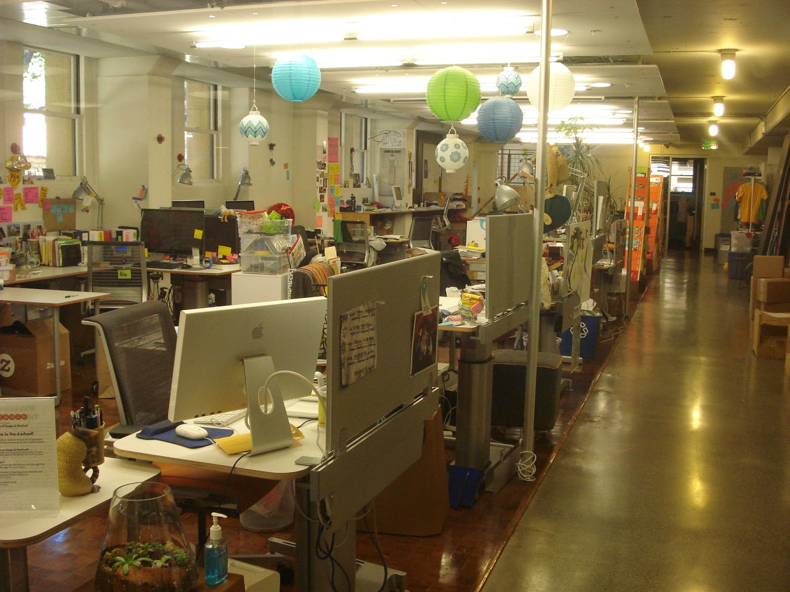
The school buildings are nestled within the green, although flat landscape, where the campus tries hard to be stately and modern at the same time. One gets an uncanny feeling of tropical ashrams, with almost outscaled courtyards centered with large evergreen spreading trees. I don't have much to really talk about this place, since we didnot have an opportunity to wander much inside the buildings. Except that we did sneak into the D-school. 

Stanford is famously know for its interdisciplinary D-school, ie, the Design School. The nature of the school was like an open space, where different kinds of people can collaborate on problems through the platform of design. There was a looming blandness of the digitality of cyberspace in the actual physical environment of the D-school. Flat white surfaces to be written upon, movable furniture, post-its, cubicles and limpy blackboards - everything as etheral and unstable as the flash of pages on a website composed the atmosphere. The wateriness or the fluidity of all objects in space took me some time to appreciate, although I wasn't sure if I got it right! 

Somehow, the post-it aesthetic (people writing mini lists and thoughts on small square colourful stick-ons pasted onto the walls) is highly overrated. Look at every design thinking wesbite today and you will find a representational picture of "thinking" in the form of a constellation of post-it pink-fluorescent green-yellow notes! To sum it up, they have literally "reduced" design thinking to keywords that can be contained into strips of paper. I have a whole theory of the post-it aesthetic, which I am being bombarded with every now and then as I visit these design places. I wonder if they have tie-ups with the post-it note manufacturing industry!

In any case, I think I might visit the campus once again to know it better and also look at its art-gallery. I have noticed that the West Coast is much behind than the North East in the US in its cultural production and aesthetic standards. Rather, much of the thrust is on the aesthetic of the virtual space.  There are some awkward gaps in the physical spaces here, which I hope I am able to articulate eventually on sustained observation of this place.